
VAMK’s Graphic Guidelines
The application of the graphic guidelines is directed and supervised by VAMK’s communications and marketing team. The use of the VAMK logo and graphics without an agreement is prohibited.
Please contact us if you need more instructions: viestinta@vamk.fi
Empathy and a Genuine Feeling
VAMK’s visual appearance describes our multidisciplinary and multinational community, where openness, empathy and a genuine sense of community are valued. We want to highlight our students and staff, so we photograph and use our own real students and staff in our photos as much as possible. The look develops little by little, like the world around it, but always keeps its recognisability and freshness with it.
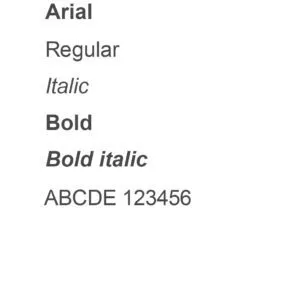
VAMK’s graphic guidelines are a practical guide for brand-appropriate communication. In the instructions, you can find information about the use of the logo and colours, typography, imagery and graphic elements.
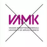
Preferred logo
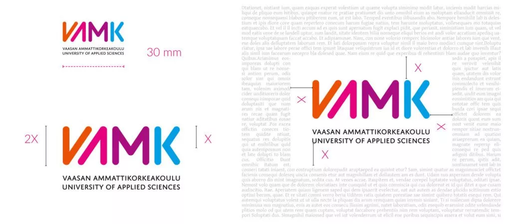
The official version of the logo of Vaasa University of Applied Sciences is four-coloured (CMYK). The VAMK colour codes of the logo can be found in the colour specifications (see Colours) and, additionally, 100% black is used in the text section. In the most recommended and preferred version, VAMK’s colourful letter section is at the top and the explanatory black text below. There is also a monochrome black version of the logo, and a negative version in white.
The shapes, relationships or colours of the original logo versions may not be altered.
- Choosing the right colour logo always depends on the colour and darkness of the logo’s background. It is important to ensure enough contrast between the background and the logo. The four-colour version of the logo (preferred) is recommended to be used on a light background. There is also a horizontal version of the logo.
The ready-made logo originals must always be used, you can find them in the folder below.
![]()
You go to Google Drive, where you can download VAMK's logos for yourself. The shapes, proportions or colours of the original business logo versions may not be changed.
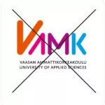
Alternative colour versions
- Monochrome logo as a negative, white 100%. The negative version is intended to be used against a black/dark coloured background.
- Monochrome logo black 100%. The black logo is always used in black-and-white materials. There is no grey version of the logo.
- Coloured logo as a negative. When set to a dark background, a negative version of the logo can be used.
![]()
Minimum size and protection area
The minimum size is determined by the width of the logo. The width of the four-colour logo must be at least 30 mm. Exceptions to the minimum size limit may only be made in special cases.
The protection area is defined according to the VAMK section so that it is always half its height. As far as possible, a protection area should be left around the logo, and no other elements may be placed inside it.
The logo may not be edited
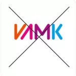
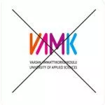
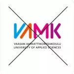
The logo’s shape, layout, parts, protection areas or colour may not be altered. The text of the logo may not be separated from the VAMK symbol except by the communications and marketing services of the university. No graphics or images may be placed on the logo protection area or the logo. You may not make your own versions of the logo. The logo must stand out from the background. The colour under the logo must never be the same colour as the VAMK text.
The subtext of the logo may not be removed without the permission of VAMK’s Art Director.
The proportions of the logo may not be changed.
The order or colours of the logo may not be changed.
The colours of the logo may not be changed.
The only monochrome versions allowed are black or white.
You may not modify the logo or make your own versions.
Graphics, text or images may not be placed in the protected area of the logo.
Graphics, text or images may not be placed in the protected area of the logo.
The logo may not be modified into an outline.
 The logo must stand out from the background.
The logo must stand out from the background.
Use the negative version or all white on dark backgrounds.
The logo must stand out from the background.
The logo must not be placed on top of a cluttered background.
The logo must stand out from the background.
Use the colour or black version on light backgrounds.
VAMK’s Colour Scheme
Our main colours are orange, pink, purple and blue. Our main colours can be seen in our logo. In addition to the main colours, we use two additional colours, green and yellow.
In VAMK’s graphic look, it is important to use colors with the right logic, and to achieve the right feeling, it is important to follow the following guidelines and familiarize yourself with the model examples carefully.
- not all colours are used at the same time
- the use of colours aims for a harmonious whole, lightness and a sympathetic impression
- prefer lighter lighting levels on large surfaces, such as backgrounds
- each field has its own colour
See the folding examples below for desirable color combinations, color combinations, color harmony and composition
Primary Colors:
The primary colors appear in VAMK’s logo. They can be used in different color versions in graphic design. It would be preferable to use light/pastel tones in the backgrounds to keep the overall impression light. Defined colors can also be used at 75%, 50% and 25%.
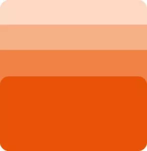
Orange
PMS 166
CMYK 0|78|100|0
RGB 224|82|6
#E05206
Energetic orange is the primary colour of VAMK that is used the most as a general shade. The colour can be seen both in our building and in various materials. It is often combined with purple as the most commonly used colour combination. Our orange colour reflects our approachability, our energy and our forward-looking approach.
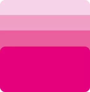
Pink
PMS Magenta
CMYK 0|100|0|0
RGB 209|0|116
#D10074
Hearty pink is the main colour of VAMK’s Health Care and Social Services field. The colour can be seen in diplomas, student stories or other marketing materials. It is often combined with purple and orange. It can therefore be used in other than Health Care and Social Services materials according to the model examples. Our pink colour reflects authenticity and friendliness.
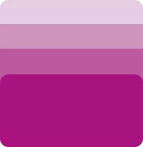
Purple
PMS 2405
CMYK 38|100|0|0
RGB 164|0|132
#A40084
Bold purple is the main colour of VAMK’s business field. The colour can be seen in diplomas, student stories or other marketing materials. It can be easily combined with all our colours. It is often used as our second general colour. Our purple colour describes courage and unyieldingness, as well as the will for genuine interaction, partnership.
Blue
PMS Cyan
CMYK 100|0|0|0
RGB 0|159|218
#009FDA
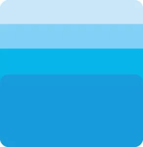
Vibrant blue is the main colour of VAMK’s technology field. The colour can be seen in diplomas, student stories or other marketing materials. It is often combined with purple and pink. It can therefore be used in materials other than engineering, according to the model examples. Our blue colour reflects clarity and openness and our marine environment.
Colours and Accessibility
The primary colours may have to be changed due to accessibility, in which case the following examples and colour shades serve as indicative colour codes. The accessibility of the colours must be checked separately on a case-by-case basis, and approved by VAMK’s marketing and communication services viestinta@vamk.fi.

Accessibility Orange
#9b2203

Accessibility Pink
#9d0457

Accessibility Purple
#7c0c63

Accessibility Blue
#4574b9
Secondary Colours
Green
PMS –
CMYK 80|10|60|0
RGB 149|198|64
#95C640
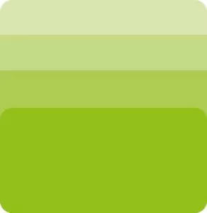
Responsible green is the main colour of VAMK’s research, development and innovation activities. The colour can be seen in projects or marketing materials related to R&D activities. The colour is combined in the logos of the research platforms with our primary colours pink, purple and blue. It is not used with orange. It may not be used in communications other than those related to R&D activities. Our green colour reflects our development work for a better and cleaner future with sustainable solutions.
Yellow
PMS 122
CMYK 0|11|80|0
RGB 252|212|80
#FCD450
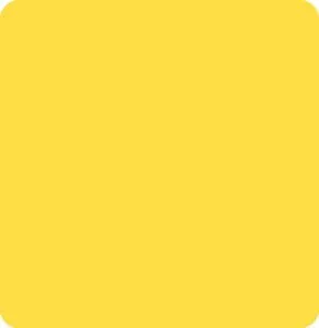
Bright yellow is VAMK’s effect colour. This colour appears as small lines, bars and texts in graphic materials. It can be combined with all colours, but it must never be used on large surfaces. It is also always the same shade, no color values are used. Our yellow colour reflects the wealth of ideas.

Accessibility Green
#6f9c1e
VAMK – Brand video
At VAMK, Vaasa University of Applied Sciences, we believe that everyone has the potential to change the world. We inspire and are inspired; we boldly experiment with new ideas and stand at the forefront of creativity and innovation. We combine the fields of technology, business, health care and social services, and design into a unified resource that addresses the complex challenges of today’s society. We are the main partner in expertise for our students, staff, and partners both nationally and internationally.
Students story – an example of a VAMK-style testimonial video
Do you want to learn how to navigate the flows of international trade with confidence? Together with the international students, the degree programme in International Business is the perfect way for you to gain higher education, excellent English skills and cultural experience.
Contact
Satu Aaltonen
Senior Specialist Communications, AD
Academic Services | Marketing and Communication Services